
PPA Group presents renewed brand identity
A fresh look that suits the growth of PPA Group
PPA Group is taking a new step in its development with the introduction of a renewed brand identity. The organization has grown significantly in recent years in terms of activities, size, and ambitions. A contemporary look aligns seamlessly with this, without abandoning the recognizable identity that PPA has stood for for years.
Renewed where possible, familiar where necessary
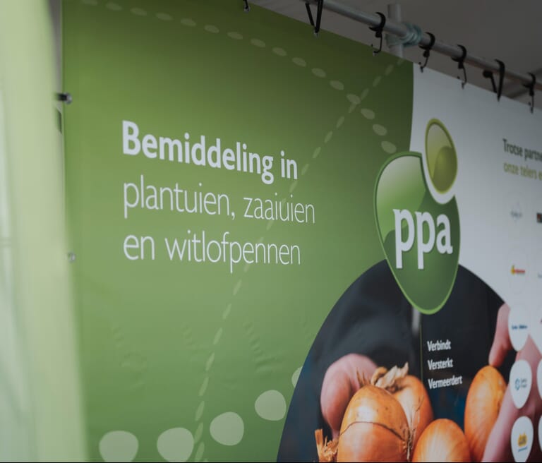
During the rebranding, a conscious decision was made to retain the familiar logo as the foundation. The visual mark has built up strong recognition within the agricultural sector and remains a powerful part of the brand. However, the logo has been given a contemporary look with natural green tones and a new typeface that better aligns with the sector in which PPA operates.
In addition, PPA is introducing a new tagline: "Connects, strengthens, multiplies." Three words that aptly summarize the role of PPA Group: connecting links in the chain, strengthening relationships, and creating added value for customers and partners.
A consistent appearance for the future
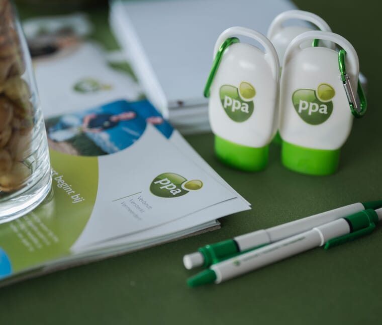
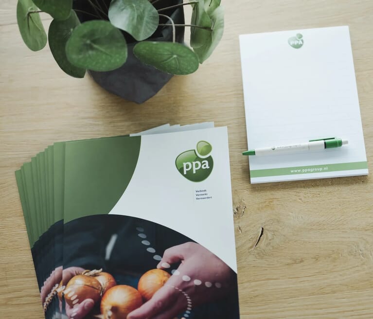
The new corporate identity will become visible step by step over the coming period. Think of updated stationery, brochures, promotional material, vehicle lettering, and, of course, the completely revamped website. From now on, the colors, typography, and communication materials will also align with a single recognizable style.
With this rebranding, PPA Group is investing not only in a modern look, but above all in a brand that is ready for the future. An image that matches the professional services and the ambition to keep the agricultural sector permanently connected.
Discover the renewed look of PPA Group
Over the coming months, the new corporate identity will become increasingly visible in all communication materials. Curious about what PPA Group can do for your company? Feel free to contact us or discover more about our services on the website.